Sin Central
By Zehra Nabi | Art Line | Published 12 years ago
The seven deadly sins have long been a source of creative inspiration for everything from movies to fashion shoots. And since these sins are so frequently found in pop culture and design, many people already have strong visual associations with each of them. Fire and brimstone, for instance, frequently manifest wrath while a figure messily devouring food represents gluttony. Thanks to such associations, the participants of the ‘7 Deadly Sins’ exhibition, held this August at the Koel Gallery, had their work cut out for them. After all, with the abundance of texts and images already available on the seven sins, how does one recreate them in a novel way?
The participants — most of them architects — certainly rose to the challenge. As a whole, the ‘7 Deadly Sins’ show, curated by architect Arshad Faruqui, not only transcended the obvious but also challenged how we view these sins.
Take Raza Zahid and Pronit Nath’s interpretation of wrath, for instance. Curving black structures, made of laser-cut acrylic, seemed to float in the air in one corner of the gallery. The undulating lines of the pieces were mesmerising while the thorn-like ridges and jet-black colour signified danger and destruction. These ‘mutations,’ as Zahid called them, are reminiscent of the massive structures designed by renowned architects such as Zaha Hadid, who Zahid once worked for. The stark pieces also highlighted how wrath can make a person vulnerable and isolated: the sharp grooves repel people from coming closer while the use of fragile acrylic means that the structures can break easily.
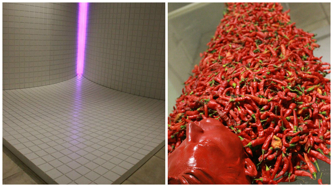
Adjacent to the striking wrath installation was architect Omar Hassan and novelist Mohsin Hamid’s unexpected take on gluttony. Instead of employing images of food, the duo took on the root of gluttony (the Latin word gluttire means to swallow) and created a space that seems to suck in the viewer. Two curving, tiled walls created an optical illusion, and between them glowed a mysterious neon light. “Space can be cannibalistic,” they wrote in their artists’ statement, and the bright light, inaccessible behind the arched walls, perhaps could be viewed as a signifier of the impossible goal: satiation. This was one of the more abstract, not to mention challenging, pieces from the show and Hassan explained that while the duo had experimented with different mediums and ideas, ultimately they had decided it would be best to strip the installation down to the basic elements. When asked why they opted for gluttony, Hamid joked, “We’re both into lust but that would have been too easy for us. So we decided to go with gluttony instead.”
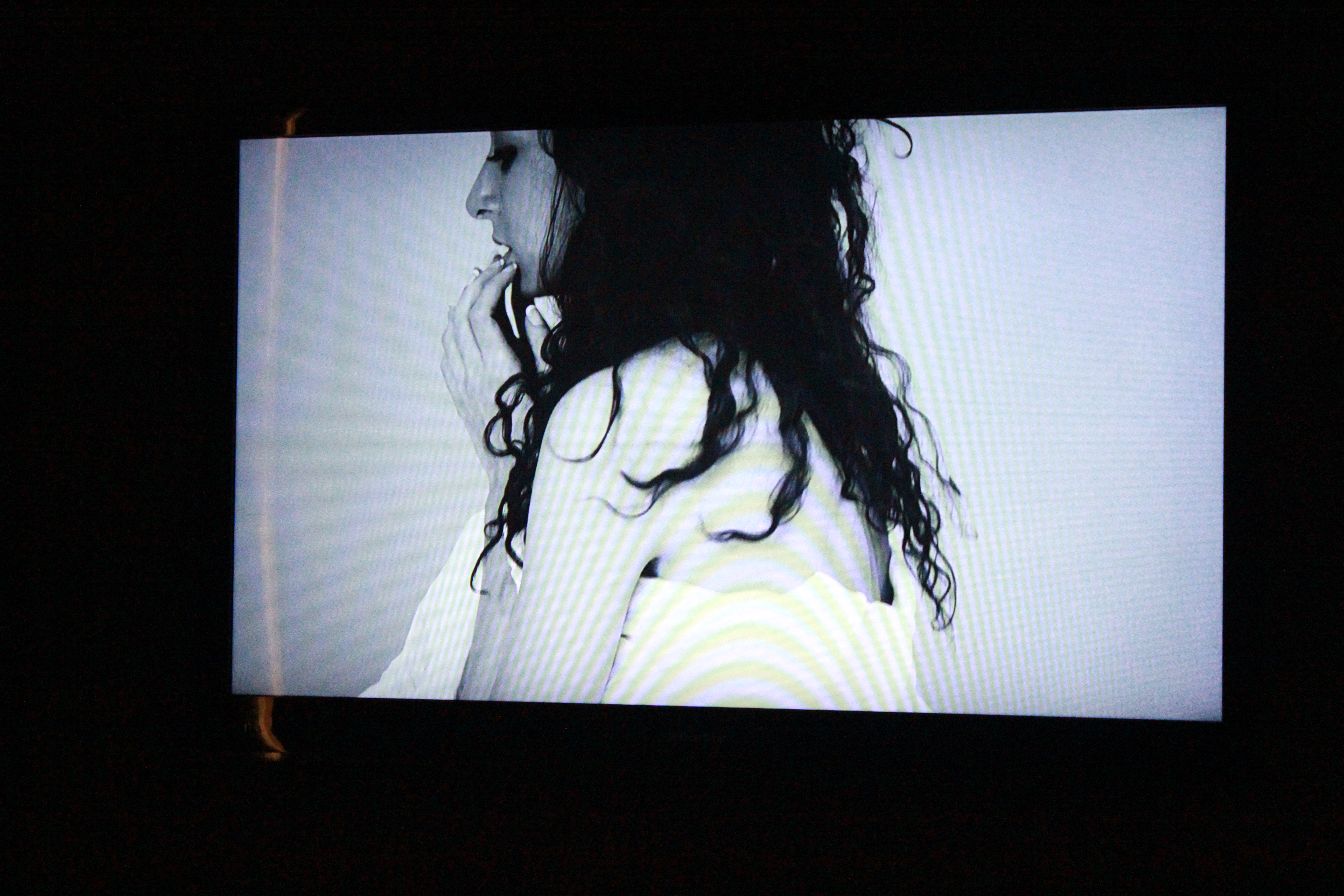
In fact, the multimedia installation on lust, which is particularly taboo in conservative Pakistan, was one of the most anticipated segments of the exhibition. Naheed Mashooqullah and Samir Sadrudin, both architects, challenged themselves by making a video a central part of their installation. Starring actor Sarwat Gillani, the video depicted Gillani portraying the many emotions, from anguish to joy, of a woman in lust, accompanied by a narration of an Urdu poem. An unmade bed was positioned before the screen (perhaps an unnecessary touch) and the area was enclosed with perforated walls, of which one had a large eye printed on it — the sense of voyeurism is hard to ignore. “Lust begins with the eye,” said Sadrudin before he went on to explain that their team chose to make a video because lust can be depicted in only a limited way with still images or statues.
Artist R. M. Naeem, architect Rashid Rasheed and interior designer Sadia Rasheed also made use of video in their installation on envy. Playing on local remedies for warding off the evil eye, the team made use of chili peppers in a stop-motion video that was projected on a wall behind two corpse-like figures made entirely of peppers. While the red chili figure was suspended from the ceiling on a glass pane, a green one was placed on the ground. Over the days of the exhibition, the green chilis slowly turned red and the red ones black ‘with envy.’
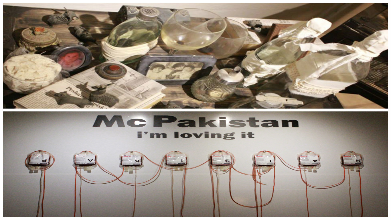
 Curator Arshad Faruqui worked with fellow architect Seema Nusrat to take on sloth. Walking into the Koel Gallery, one was greeted with shelves of gathris (bundles) and various objects all swathed in white fabric. The books, toys, bottles, etc. had long been left unused by their owners and were donated to Faruqui by family members especially for this exhibition. The rusty picture frames and dusty wineglasses clearly suggested abandonment and the use of gathris, as Faruqui explained, symbolised the emotions and memories that people put aside as ‘baggage’ instead of resolving. Although the objects individually suggested neglect out of laziness, the neat arrangements were not in line with the clutter normally associated with sloth — but Faruqui and Nusrat wanted to avoid the obvious. In fact, as attendees stopped to look at the several objects that had carefully been placed together for this sin, time seemed to slow down and the static installation, with no singular focal point, effectively captured the stillness associated with sloth.

While most of the sins were represented rather abstractly, architect Omar Omari and graphic designer Sara Chapra made extensive use of text in a very pop-art, in-your-face take on greed. ‘McPakistan — I’m loving it,’ was emblazoned on the wall and although the text clearly plays on the slogan of a fast food chain, the installation was more about the greed of local politicians than about mass consumerism. A row of blood bags hung on the wall, with the label on each giving the synopsis of a local corruption scandal. “We were asked to join this show around the time of the elections and I was very politically charged at the time,” Omari explained. The ‘Mc’ before Pakistan, he revealed, was also an abbreviation of an Urdu curse word and the installation was a very pointed, if not a somewhat literal, take on greed.

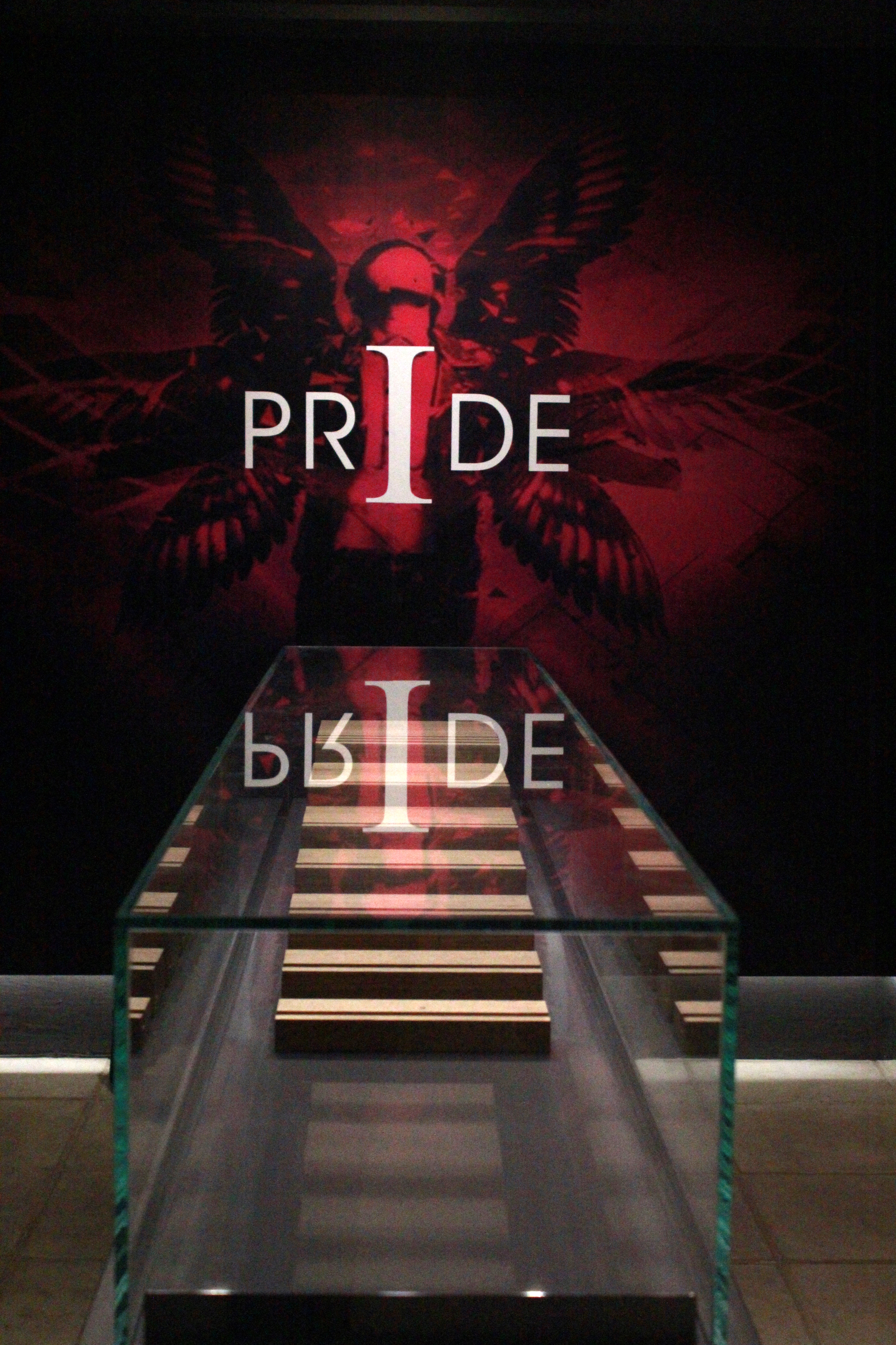
Architect Usman Khan, aided by colleagues Saadiya Talat, Danish Shahid and Noor Saeed Khan, was assigned pride — often acknowledged as the root of all sins. A narrow section of the gallery was filled with digital prints of a purple background with quotes on pride on it. In the middle, inside a display case, was a small wooden structure consisting of seven steps. From one end of the installation, the steps seemed to form an altar and ‘pride,’ boldly printed on the wall before it, appeared to be both the final destination and the object of devotion. But looking from the other side, as Usman Khan explained, the steps seemed to descend into an abyss, suggesting the ultimate fall that follows all sins. The shrine-like setting was very apt for this sin, but the prints seemed arbitrary and the small steps could perhaps have been enlarged for a more effective rumination on pride.
 From one end of the installation, the steps seemed to form an altar and ‘pride,’ boldly printed on the wall before it, appeared to be both the final destination and the object of devotion.
While Faruqui has previously collaborated with architects for various exhibitions and books, with ‘7 Deadly Sins’ he wanted to take on a more challenging project. “I wanted to select architects who have never done art installations before and push them beyond their comfort zones.” And they, in turn, took the tried and tested concept of the seven deadly sins and pushed it to a whole new level.
Zehra Nabi is a graduate student in The Writing Seminars at the Johns Hopkins University. She previously worked at Newsline and The Express Tribune.


